Standard Paint Finish Options
We offer standard paint colors along with endless possibilities
Our popular selections of paint finishes are in demand and requested by
interior designers, architects, and dealers.
If you don't see the color you want below, click on our Custom Color Program and we will give you more options and finish possibilities.
Current Standard Paint Finishes
Stone Hearth
- Uniquely soft and warm, this paint finish belongs to the yellow hue family but because of where it lives on the color wheel .
Closest Representation: Ben Moore - 984 - Stone Hearth
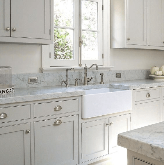
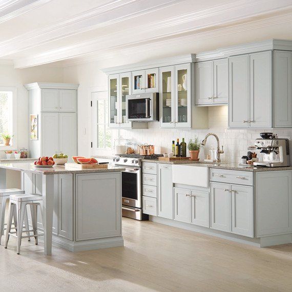
Simply Gray
- A soft, gray with a slight red undertone. It is a beautiful light gray with a slightly warm feel to it without looking remotely greige. It is the most ‘pretty’ with a slightly feminine hue and subtle undertones.
Closest Representation: Valspar - 4003-1B - Filtered Shade
Closest Representation: Ben Moore - HC-170 - Stonington Gray

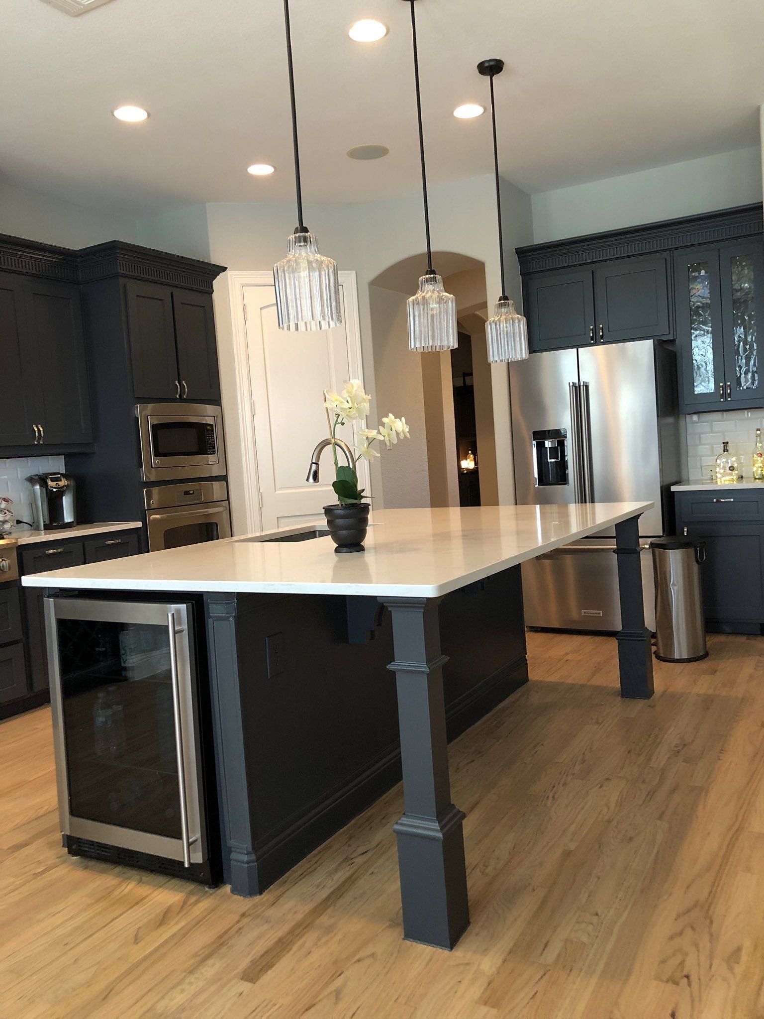
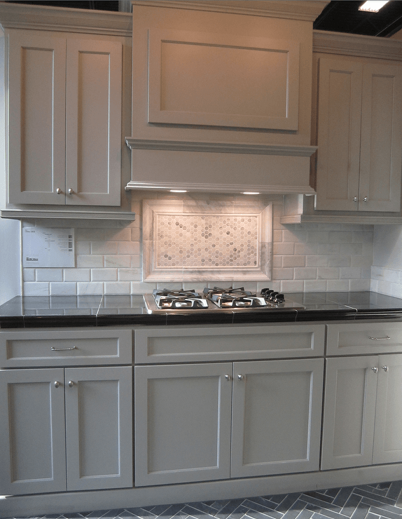
Wrought Iron
- looking for a deeper, richer gray? Choose our Wrought Iron because it is a true gray that coordinates with many of todays stone patterns. This color adds a richness to any kitchen and it really pops against the lighter flooring patterns.
Closest Representation: Valspar - 4005-2C - Muskeg Gray
Closest Representation: Ben Moore - 2124-10 - Wrought Iron
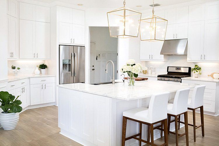
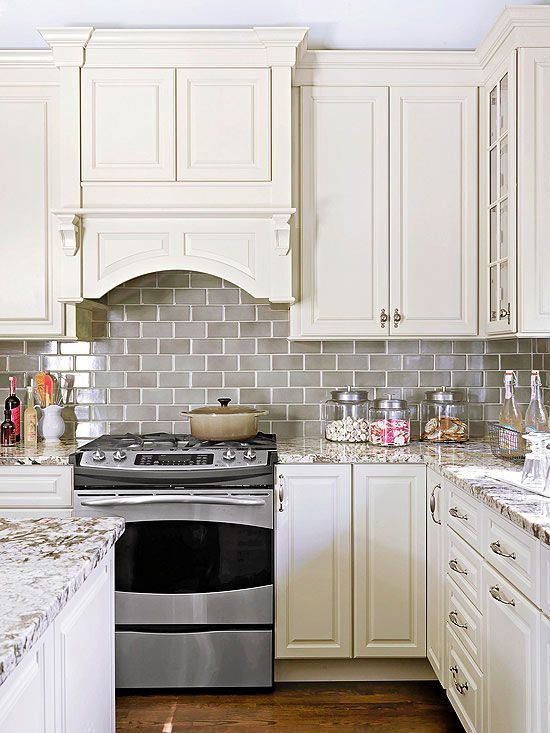
Simply White
- is not a true white. Because of it’s pale yellow undertones it is a very warm white. If you are looking for an off-white that gives off a lot of warmth this is good choice (no harsh, hospital vibes). ‘Simply White’ glows, and is especially useful in rooms with no windows or perhaps north facing rooms that get little sunlight because the paint color itself resembles light. It will create a light and airy space. If you have artwork or a colorful decorative souvenirs you want to showcase in your space this color will really compliment the room.
Closest Representation: Valspar - 7006-24 - Ultra White

Feather Gray
- Their are just a few colors that will give your cabinetry that spa like, serenity feeling. And always be sure to test your paint choice with your new counter tops and tile selections.
The trend towards softer gray finishes is here and going to be around for a while.
Closest Representation: Ben Moore - 2127-60 - Feather Gray
Slate Gray
- Slate gray is a gray color with a slight azure tinge that is a representation of the average color of the material slate. As a tertiary color, slate is an equal mix of purple and green pigments. This medium toned finish brings warmth and depth to your cabinetry. Popular door styles in this warm gray paint are Shaker and Stockholm.
Closest Representation: Ben Moore - 2128-40 - Oxford Gray
Galveston Gray
- When gray meets beige and hints of brown tones, you get this beautiful finish. Part of America's Colors, a concise collection of soft neutrals featuring a snapshot in color of America's most popular, well-traveled regions. It is a subtle color which delivers the pale gray tones of our beautiful coastlines with the rich, clay earthtones of the Southwest desert.
Closest Representation: Ben Moore - AC-27 - Galveston Gray
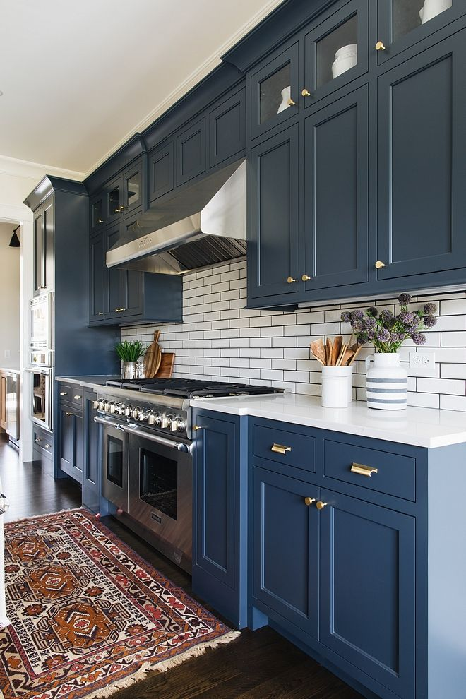
Royal Navy
- Royal Navy is a dark, neutral, concord blue-purple with a plum undertone. It is a perfect paint color for cabinetry. Pair it with white cabinets for great contrast.
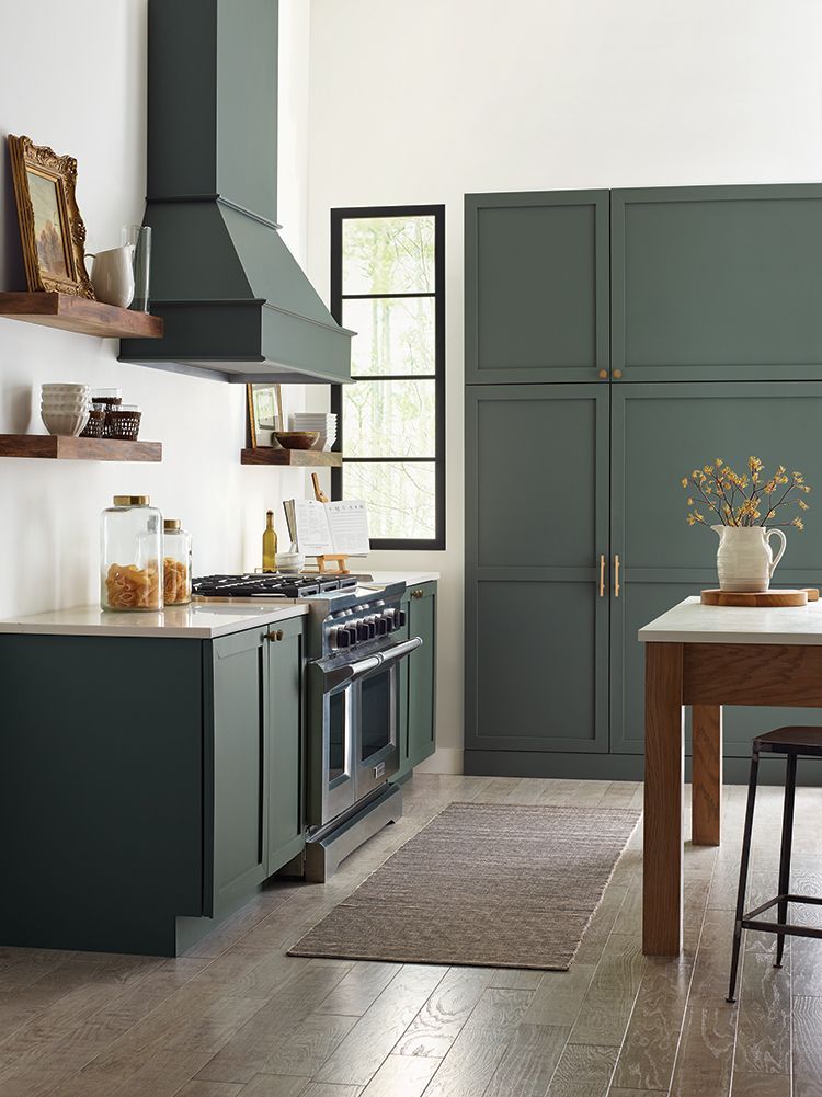
Succulent - Soft green shade that is great for a pop of color.
Don’t be afraid to get colorful in the kitchen. Today, light grays and whites can be replaced by hues that invite a bolder style into your space. The good news is that you don’t have to completely redo your kitchen to get the look. Keep kitchen walls a neutral hue and paint the cabinets in a richer color like a deep shade of green. The contrast will add instant depth to the room and make your kitchen feel new.
Please note—all photos used in this catalog are only a representation of the door or cabinet style.
Actual wood finishes, doors, etc. should be seen and approved prior to ordering any products.